Portfolio
Logo Design

TOP Logo
I joined the company PrHacker whilst the company was undergoing a rebrand, into a full service agency named "TOP." I worked within a core design team with two senior designers to build the branding for the new company. I contributed color theory research, UX and logo design support.
The Challenge:
TOP stands for "Test, Optimize, Perform," yet also symbolizes being at the top of the field. TOP is also an agency network of 12 subagencies, each of which would function as an independent actor. How do we present a cohesive visual identity when speaking to vastly different demographics and clients?
The Solution:
A flexible yet iconoclastic logo which could be modified by changing one key feature (ex, colors, or a shape) to denote a different agency.

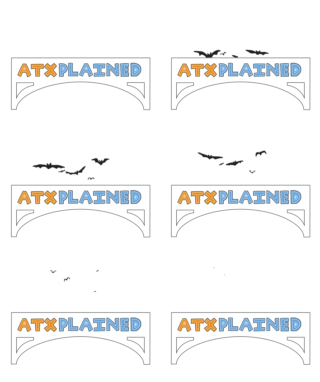
ATXPlained Logo
KUT Media, 90.5 was looking to refresh the brand of their ATXPlained project, a collection of stories focused on local oddities and stories.
The Challenge:
Create a dynamic but clean logo that is instantly "Austin."
The Solution:
I adapted the imagery of Austin's famous Congress Bridge + graffiti. The bat animation anchors the logo's sense of place, while also attracting attention on a digital screen. The branded colors of orange and blue recall Austin's major university and the dominant color of its skyline.


Others
Above are logos for Themis, a sexual assault legal support non-profit, Common Good City Farm, an urban farm in Ledroit Park, Washington D.C., VVNS&G Law Firm, the Talking Tolkien Book Club Podcast, and Porridge.blog.
